The Limitation of Accuracy of Classification Models
It didn’t occur to me that even if a classification model can perfectly estimate the probability of an outcome, the accuracy of the prediction can still be low. This post explains the phenomenon.
Consider a model which can provide the estimated probability of an outcome based on the inputs from predictors. Suppose for any observation, the predicted outcome is generated randomly according to the estimated probability, then the accuracy of the prediction can be expressed as a function of the true probability \(p_1\) and the estimated probability \(p_2\):
\[ \begin{align} A(p_1, p_2) &= p_1p_2 + (1 - p_1)(1-p_2) \\ &= (2p_1 - 1)p_2 + 1 - p_1 \end{align} \quad (1) \]
The derivative of the function \(A()\) of the variable \(p_2\) is:
\[ A'_{p_2} = 2p_1 - 1 \quad (2) \]
According to the derivative, as \(p_2\) increases, \(A(p_1, p_2)\): increases monotonically if \(p_1 > 0.5\); decreases monotonically if \(p_1 < 0.5\); remains constant if \(p_1 = 0.5\). Therefore, given any \(p_1 > 0.5\), \(A(p_1, p_2)\) is only maximized when \(p_2 = 1\); while given any \(p_1 < 0.5\), \(A(p_1, p_2)\) is only maximized when \(p_2 = 0\). In any case, the maximization is not reached when \(p_1 = p_2\)1.
1 Unless \(p_2 = 0 \ or \ 1\).
Figure 1 visualizes the relationship among \(A(p_1, p_2)\), \(p_1\) and \(p_2\).
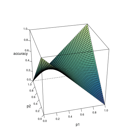
Formula (3) shows how the maximized accuracy changes with different value of \(p_1\). Under almost all circumstances, the accuracy does not reach 1; and the closer \(p_1\) is to 0.5, the worse the accuracy. This helps to understand the limitation of classification algorithms.
\[ \begin{equation} A_{max} = \begin{cases} p_1 & p_1 > 0.5 \\ 0.5 & p_1 = 0.5 \\ 1 - p_1 & p_1 < 0.5 \end{cases} \end{equation} \quad (3) \]
Some useful notes on the code that makes Figure 1 :
library(tidyverse)
library(lattice)

dat <- crossing(p1 = seq(0, 1, 0.025),
                p2 = seq(0, 1, 0.025)) %>%
  mutate(accuracy = p1 * p2 + (1 - p1) * (1 - p2))

walk(seq(15, 75, 15), function(z) {
  png(sprintf("%03i.png", z))
  wireframe(accuracy ~ p1 + p2, data = dat,
                 par.settings = list(axis.line = list(col = 'transparent')), scales = list(arrows = FALSE, col = "black"), # Remove the border, but keep the axis ticks.
                 screen = list(z = z, x = -60), # Rotate the screen (default: z = 40, x = -60). The `manipulate::manipulate()` function is a useful tool to that helps to inspect the plot from different directions.
                 drape = T, col.regions = colorRampPalette(c("#5e4fa2", "#3288bd", "#66c2a5", "#abdda4", "#e6f598"))(100), colorkey = F, # Coloring.
                 aspect = c(1, 1) # The ratios of y/x axis and z/x axis.
            ) %>%
    print()
  dev.off()
})

# A few more notes.
# The following parameters may be useful when there are multiple panels:
# `as.table = TRUE`
# `strip = strip.custom(strip.names = T)`
# `layout = c(2, 3)`

system("convert -delay 100 *.png figure_01.gif")
# The `convert` program is a member of the ImageMagick suite of tools. This command should be executed on a Linux operating system.
# The `-delay` option controls how many ticks to wait until the next frame is shown; there are 100 ticks in a second.